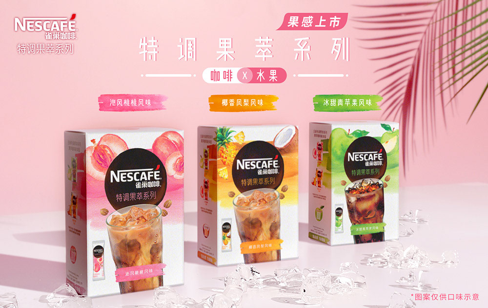
Since coffee consumption is rapidly growing in China - especially amongst young consumers, Nescafé has created an innovative line to resonate with this audience. It’s called Nescafé 特调果萃系列 (Special Fruity Series) and it is designed to be enjoyed in the summer. The product is an instant mix of ice coffee combined with fruity flavor.
A watercolor technique was used in order to give it a natural and vivid look on the packaging, besides being contemporary and relevant for the target audience. The background brushes delivers the idea of multi-layers of flavor, while the fruit illustrations brings a delicate touch to the design.
The coffee cup works as a ‘hero’ in the pack to drive appetite appeal and indicate the consumption form. The white background brings a fresh sensation and creates an attention point in the shelf by breaking the usual coffee category cues.
@ Cowan
Creative Direction: Sam Profeta, Kellie Johnson
Client Management: Angeline Kong
Packaging Design: Tom Alsins
Visualization: Run Yu Niu
2019 / All rights belong to Nestlé and Cowan.
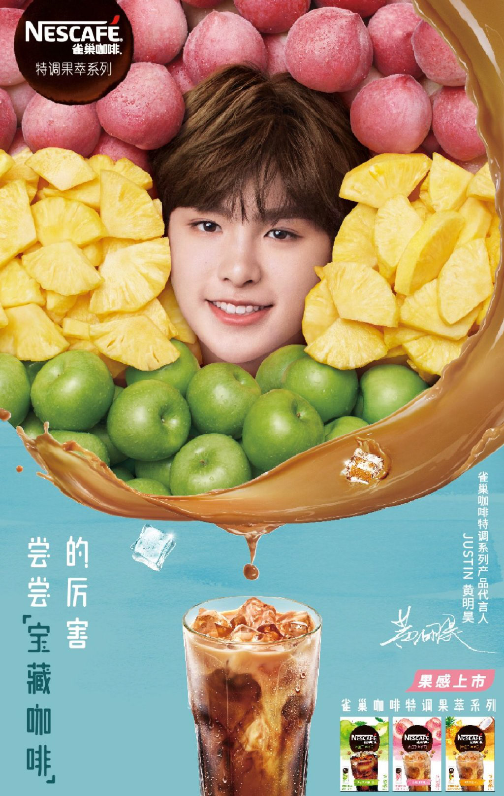
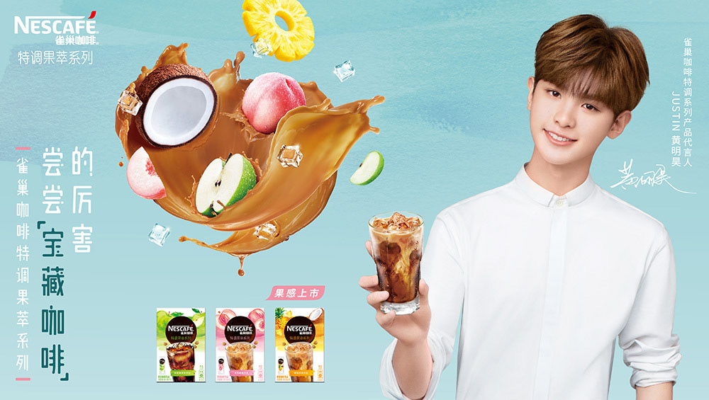
Digital campaign and e-commerce ADs (developed by third-part suppliers)


