
Best Berry is a healthy snacks signature club. Since their products are tasty and indulgent, different from most competitors, the brand was looking for a graphic expression that could break with the healthy food category cues.
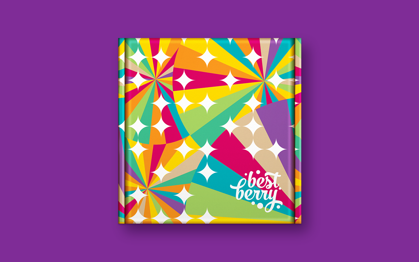
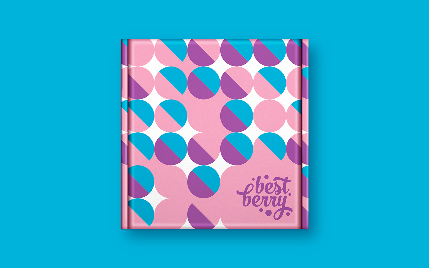
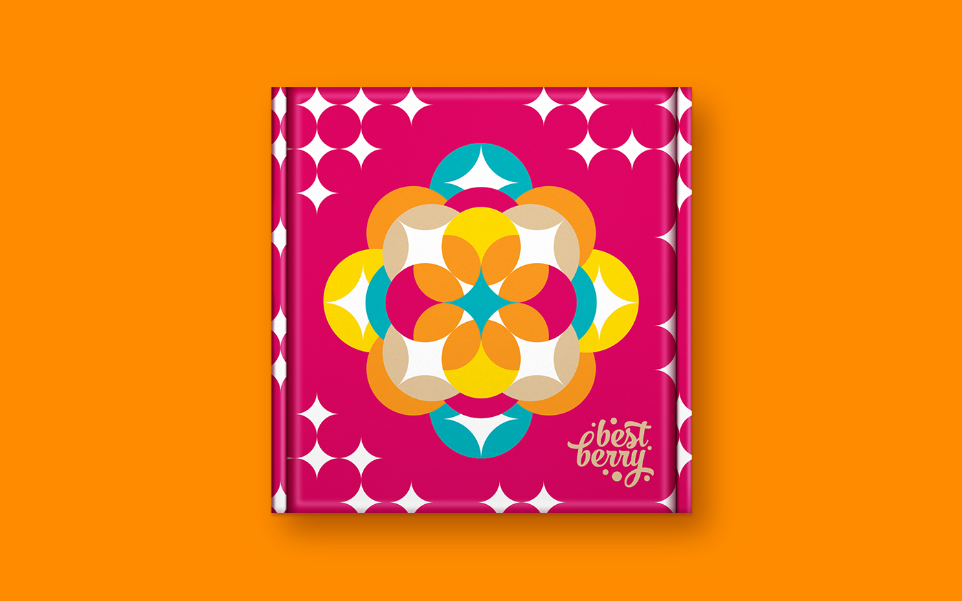
The colors and graphic elements delivers joy and excitement, while the new logo has fluid typography that evokes pleasure. The brand identity has also a pattern that plays with geometric shapes symbolizing the best (star icon) and the berries (circles).
The packaging visuals were designed to reflect the brand's youthful spirit and enchant the customers who would receive the products at home.
2015


Before and after

Main packaging line

Seasonal packaging
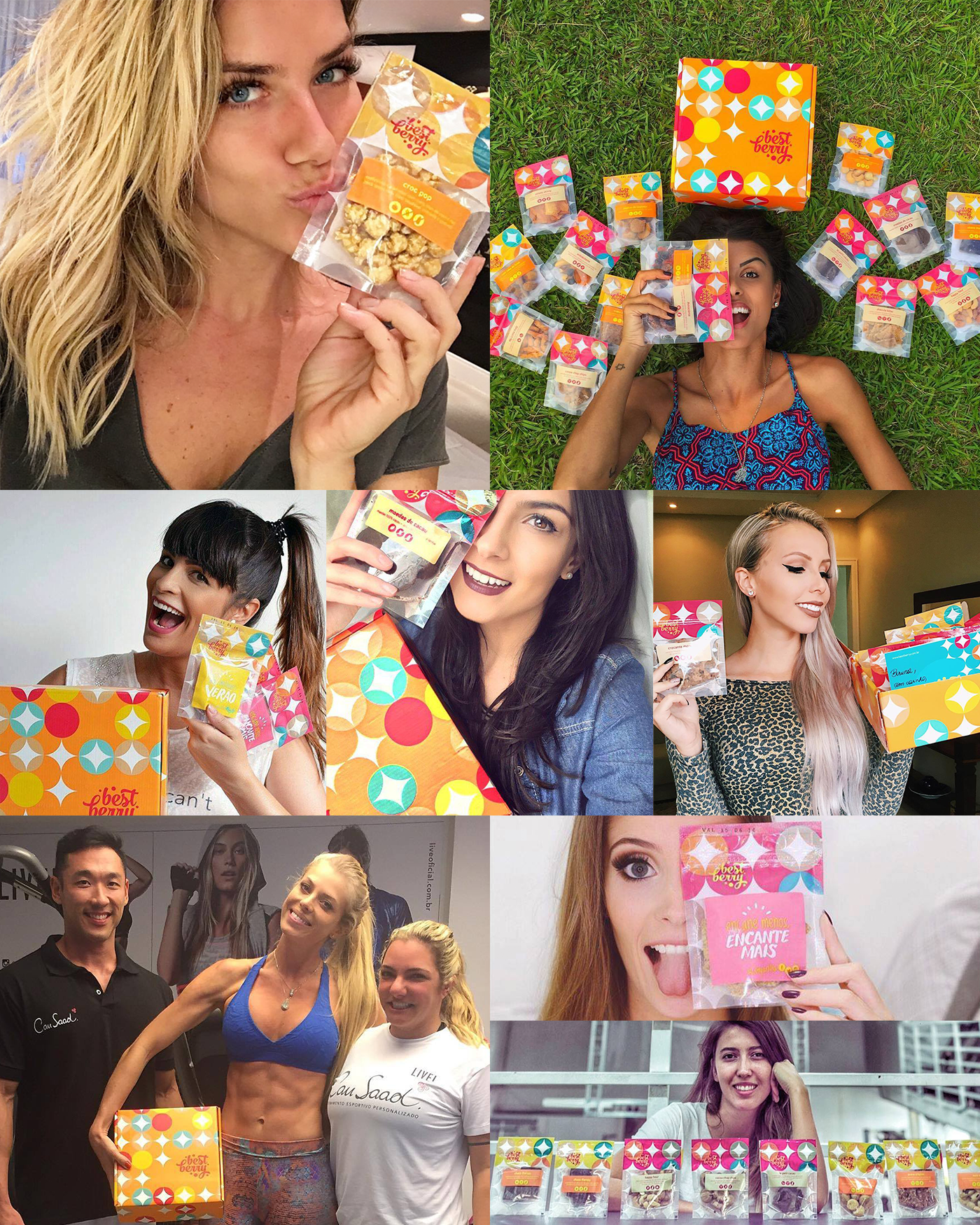
Social media buzz